
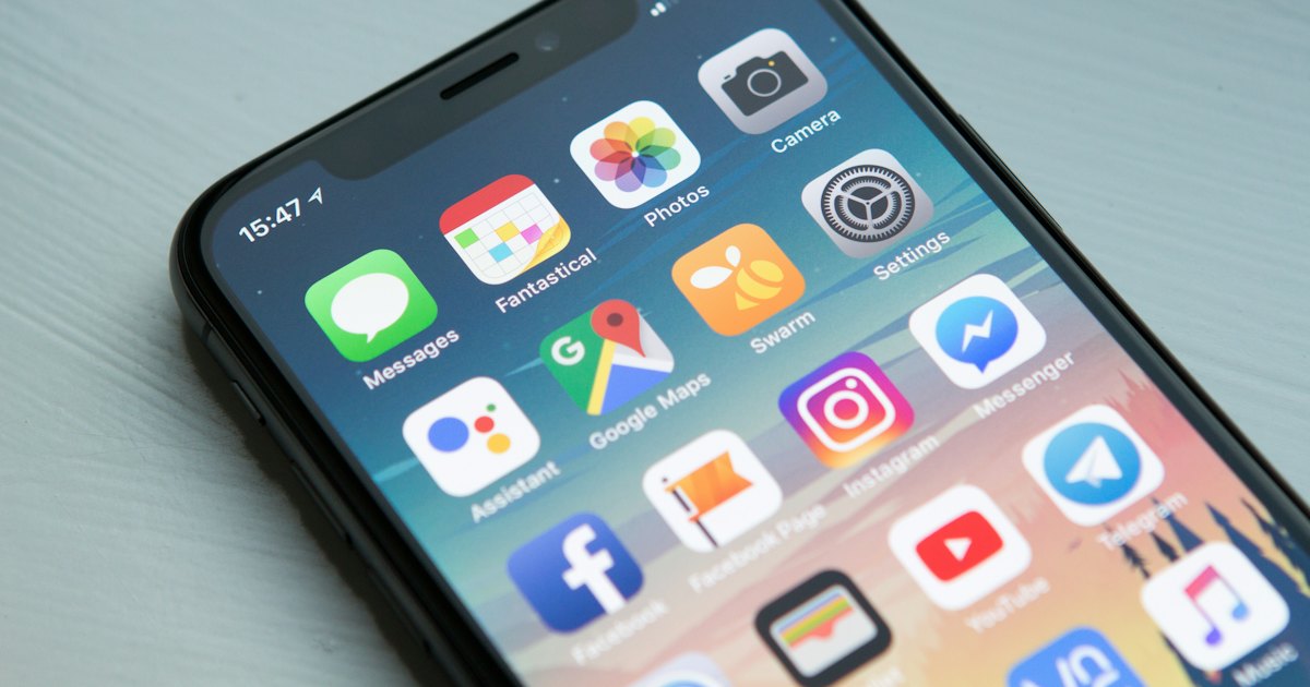
Most visitors arrive on a phone. Most testing happens on a laptop. That gap is where lost enquiries hide.
A narrow browser window is not a phone. It has a faster connection, a mouse, more memory, no notch, no on-screen keyboard and no thumb obscuring the bottom of the screen. Before publishing anything, spend ten minutes with a real handset.
The ten minute test
- Open the home page on mobile data rather than office wifi.
- Read the first heading without zooming.
- Tap the phone number and confirm it starts a call.
- Open the menu, visit a service page and come back.
- Complete the contact form and check the enquiry arrives.
- Rotate the phone to landscape and check nothing breaks.
If any of those steps makes you pause, a visitor with less patience has already left.
Things that only show up on a handset
The keyboard covering the field
When the on-screen keyboard opens, it can hide the field being typed into and the submit button below it. Test the last field on your longest form, not the first.
Sideways scrolling
One wide table, an unbroken long word or an image with a fixed width will push the page sideways. It feels broken immediately. Scroll down the whole page and check nothing shifts left and right.
Targets too small or too close
Tap targets need to be around forty-four pixels square with space between them. Links stacked in a footer or icons in a row are the usual offenders. If you have to aim, it is too small.
Layout jumping while it loads
Text appears, then an image loads above it and pushes everything down as you are about to tap. Setting width and height on images prevents most of this. Banners and cookie notices injected late are the other cause.
Readability
Body text should be at least sixteen pixels, with generous line height and lines that are not too long. Grey text on a light grey background may look refined on a bright monitor and be unreadable outdoors. Check contrast, and check it in daylight.
Speed on a real connection
Throttle the connection in your browser tools, or simply walk somewhere with weak signal. Watch what appears first. If the useful content arrives after a hero video, a font download and three scripts, reorder the priorities. Load images below the fold lazily, and serve them at the size the phone actually needs.
Design for the mobile version first
When mobile is an afterthought, the result is a desktop page stacked into one column, with the most useful content buried under decoration. Decide what a visitor on a phone needs to see in the first screen, put that at the top, and let the desktop layout be the version that has room to spare.